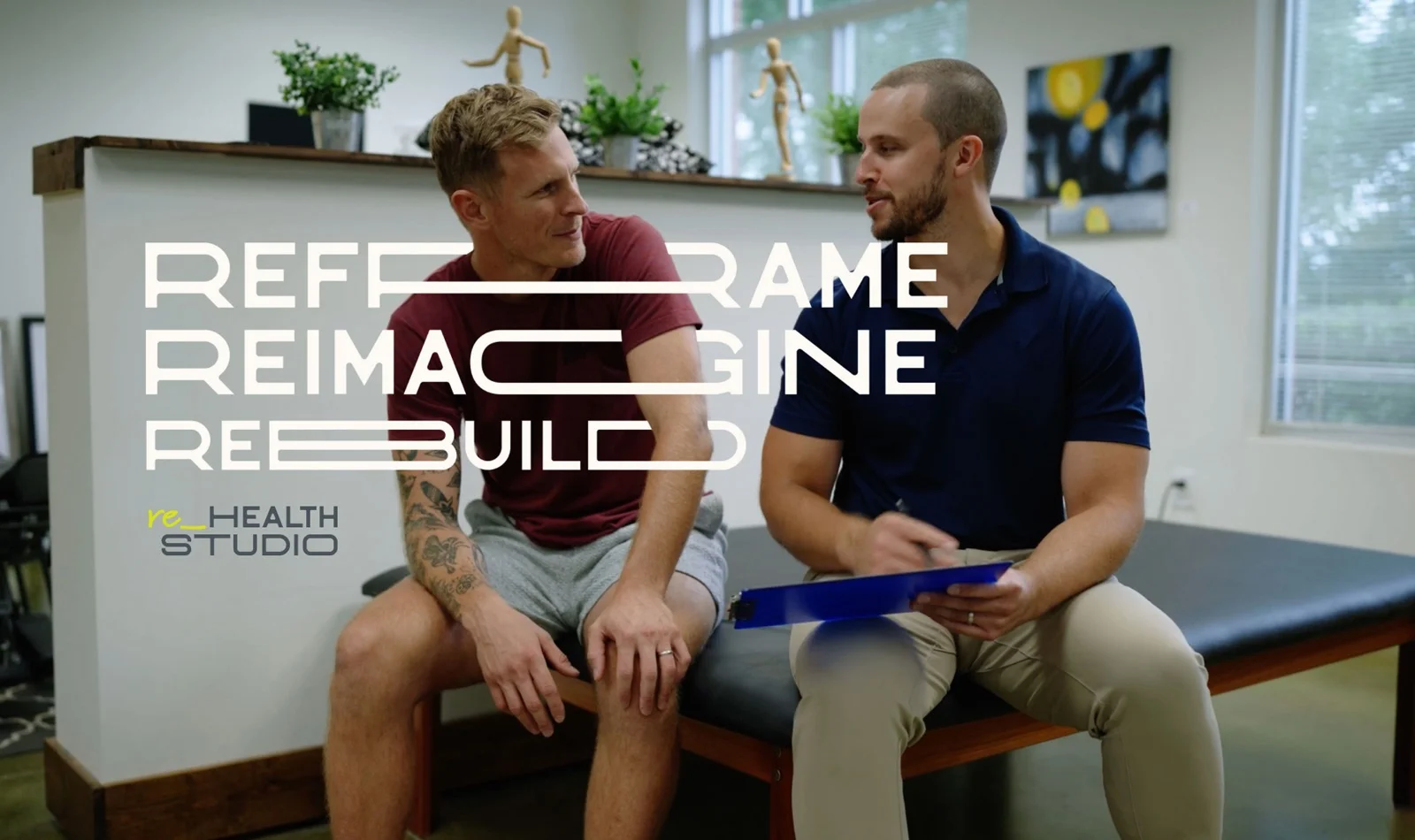


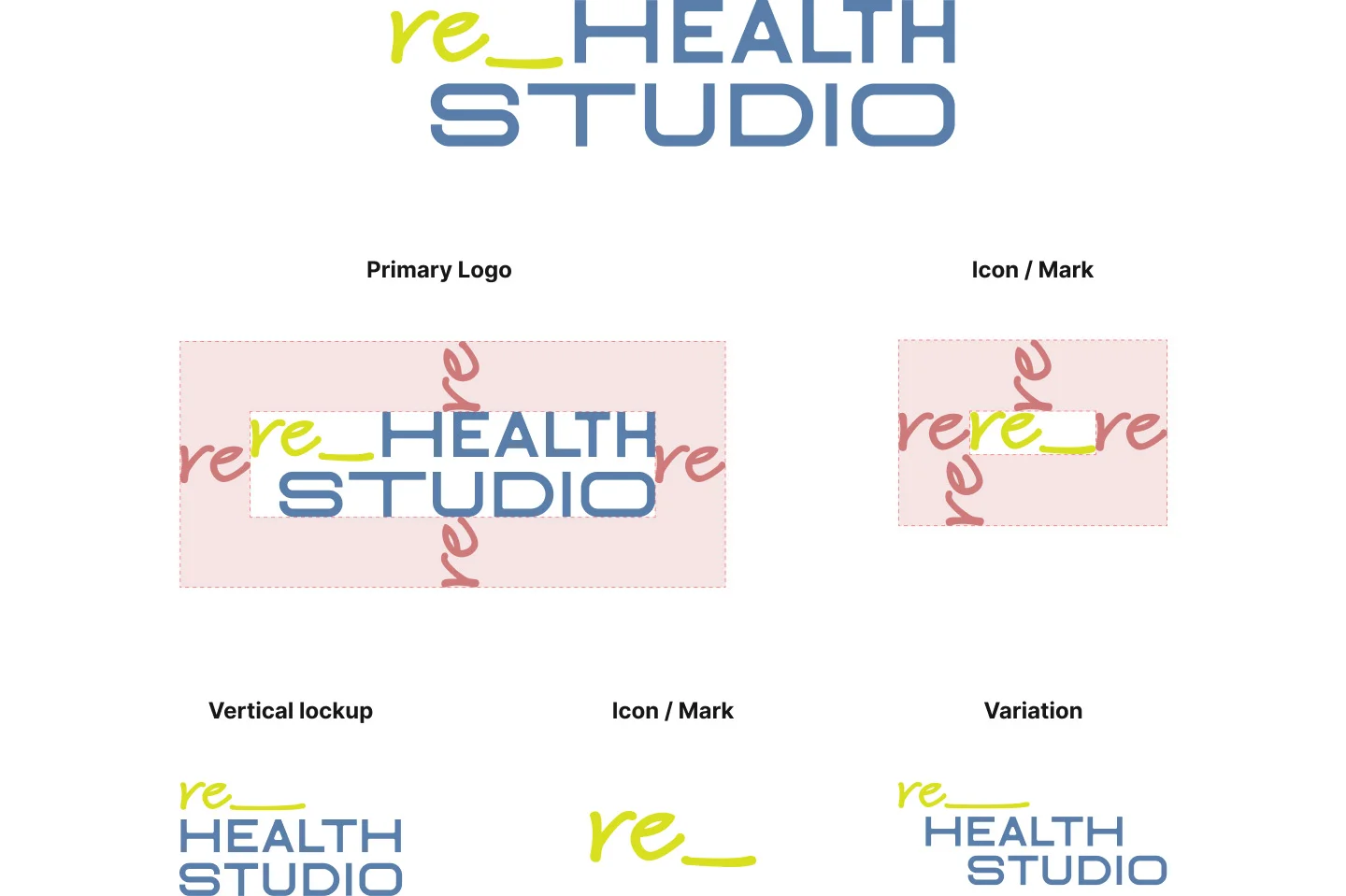
The website design mirrored their brand identity, offering a seamless and intuitive user experience. It was more than just a website; it was a digital showcase of wellness. Our goal was to create a space that was visually appealing yet highly functional, simplifying navigation and encouraging engagement with their services.
Our collaboration with re_Health Studio went beyond branding and website design. Our mission was to create office materials, swag, and apparel that were not only functional but also aligned with the overall wellness vision.


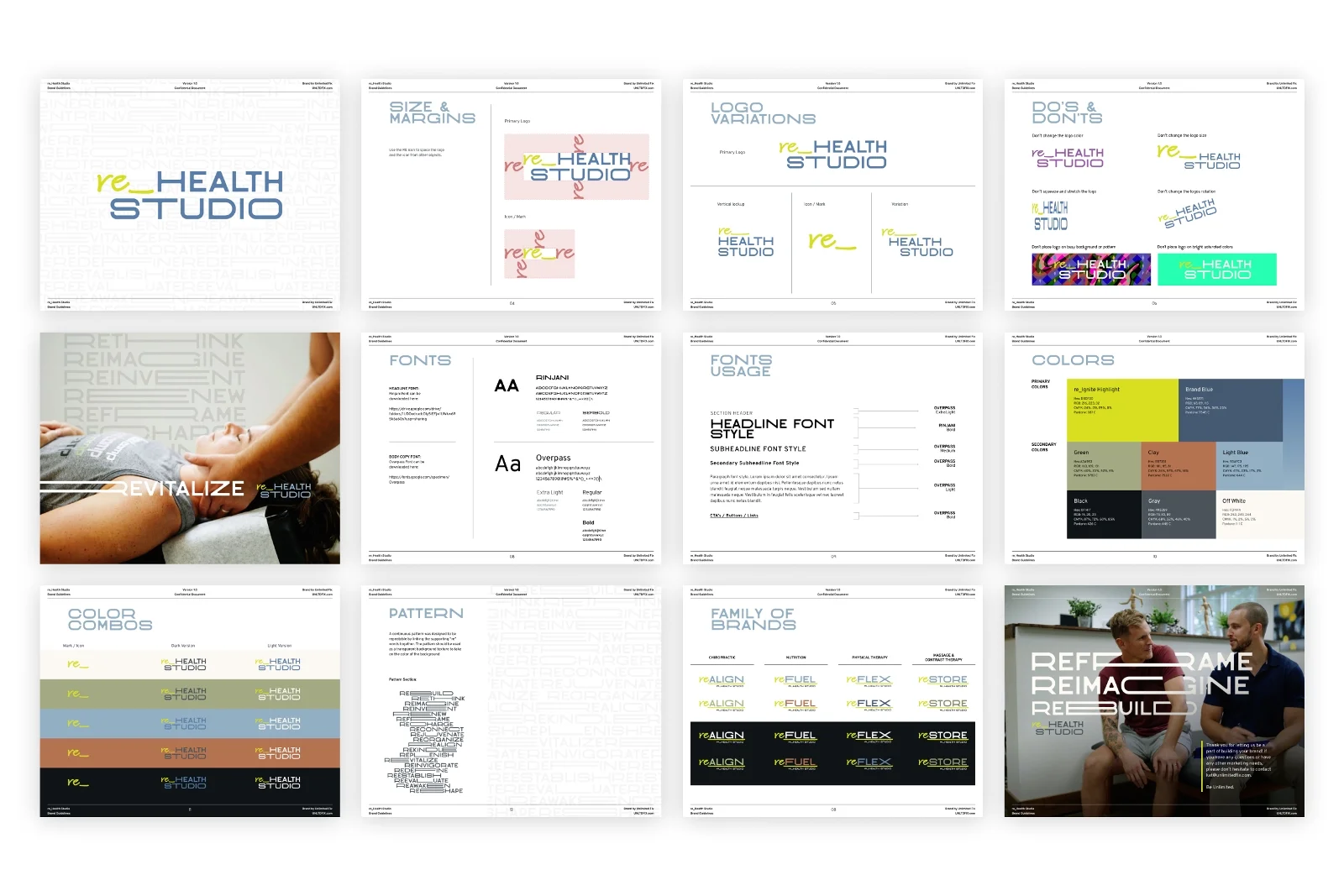
The UNLTD FIX touch that makes re_Health Studio a stand out in the health industry.
Individualized Care
The branding emphasizes personalized treatment plans for each patient, aligning with modern health care trends.
Visual Harmony
The use of design elements to convey balance and harmony, mirroring the studio's philosophy of restoring bodily balance.
User-Friendly Design
The website's easy navigation and informative layout help visitors understand the studio's services.
Educational Focus
The website design highlights the importance of educating patients about chiropractic care and natural healing.
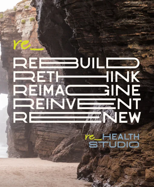
re_Thinking the Brand
We set them up as the leader of a family of re_ brands. This approach will allow them to offer a well-rounded experience in chiropractic and wellness.
